- Maintain a dark yellow colour scheme, much like the floor in both the front and back covers and hence not varying too much.
- Have 6 pages to my insert, this allows me to provide good amounts of information without it getting tedious and boring for a viewer
- The conventions used include fades and blends throughout, using multiple images. This has a fantastic effect and hence I decided to take this into my insert as an idea.

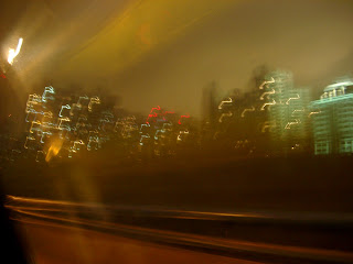
I really like this image because it maintains many conventions of a blurred image whilst also sustaining complexity and realism, this will be the perfect background image for my insert.
The image below is that of an amp, I am going to use this along with other images to produce foreground images for my insert (obviously behind the text), these images will provide the insert with contrast and complexity, making them more interesting for the viewer. This is very important when creating an insert as the amount of pages is a potential bore for viewers, therefore the images are the attraction and must be continually attractive. I am going to use Adobe Photoshop, like in my other preliminary pieces, to manipulate this image to eliminate the background and place the image on the background of my choice.

No comments:
Post a Comment