(Click to Enlarge!)
Showing posts with label Preliminary. Show all posts
Thursday, 23 February 2012
Insert Booklet (Digipak) - Creation
When creating my CD Digipak insert I took many things into account, such as the conventions used in this specific genre of music to create an effective Digipak insert, the colour schemes maintained throughout both covers and the Insert and also the amount of pages my insert should consist of. Many websites helped me to discover which styles, colours and quantities work most effectively and hence I decided upon these

- Maintain a dark yellow colour scheme, much like the floor in both the front and back covers and hence not varying too much.
- Have 6 pages to my insert, this allows me to provide good amounts of information without it getting tedious and boring for a viewer
- The conventions used include fades and blends throughout, using multiple images. This has a fantastic effect and hence I decided to take this into my insert as an idea.

I really like this image because it maintains many conventions of a blurred image whilst also sustaining complexity and realism, this will be the perfect background image for my insert.
The image below is that of an amp, I am going to use this along with other images to produce foreground images for my insert (obviously behind the text), these images will provide the insert with contrast and complexity, making them more interesting for the viewer. This is very important when creating an insert as the amount of pages is a potential bore for viewers, therefore the images are the attraction and must be continually attractive. I am going to use Adobe Photoshop, like in my other preliminary pieces, to manipulate this image to eliminate the background and place the image on the background of my choice.
Sunday, 19 February 2012
Insert Booklet (Digipak) - Ideas
This is a website I looked into which gives an insight for some of the modern specification when creating a CD insert to a Digipack. The website explains how to make a Digipack using PS, however I did not follow this exactly, I used some of the underlining principles and expanded upon them. The link is below.
The Creation of a CD Insert
The website helped me a lot, as, although it is not specifically about the ideas for what is inside the insert, it gives me ideas for the layout; principles that are necessary to a good looking insert, how colour contrasts are effective and also how to use images in a corresponding pattern with text.
This is the produced Insert from the link above, I really like the insert as a whole, the fire images blended with the meaningful image in the top left works well to create a good feel to the insert. I am going to take some of the conventions used here into my insert, such as the fire images used as a blended image. I am also going to use this layout for an insert, with three folded sections to create an overall 6-fold insert. I think this is a good size as it provides lots of information without getting tedious for the viewer.
The Creation of a CD Insert
The website helped me a lot, as, although it is not specifically about the ideas for what is inside the insert, it gives me ideas for the layout; principles that are necessary to a good looking insert, how colour contrasts are effective and also how to use images in a corresponding pattern with text.
DIGIPACK
View more PowerPoint from Digipak Research
Monday, 6 February 2012
Insert Booklet (Digipak) - Research
An insert or, booklet to a CD Digipack is a small template of pages which contain other information about the band and CD - whether it be a new release or not. The booklet usually contains information about the individual members of the band, as well as past experiences; (tours, gigs etc). The booklet may also contain more information about the individual tracks on the CD itself, giving the reader an insight as to what the songs are about. Some inserts even contain the lyrics to all the tracks on the album.
The layout of an insert to a CD Digipack is very simple. Depending on the size, a booklet can be any number from 4-40 pages, (whether that would fit into a CD case I don't know!) They are easy to create, simply combining and folding a larger landscape scaled piece of paper, cut to size, and folding it to the length/width of the CD case. This can then be bound using a stapler etc.
Many bands and artists use this booklet as a message of transferring information about their music to different target audiences. The booklet will remain available for viewers to see the bands gig dates, shows, upcoming tracks etc. The insert usually continuates the colour scheme throughout the Digipack, as to not look out of place, and the text is small as it has to be due to the decreased size.
The example of a layout of an insert booklet shows how simple the design is, however, only 4 pages creates 8 sides of information which can be too much to hold consumer interest. Therefore I would recommend this as the maximum number of pages for a panflet such as this one. I am going to use this many pages in my booklet for a simple reason. The band is already existant, therefore, the target audience may want to delve deeper into the band information, meaning I will need at least 8 pages, as I intend to do a profile of information, including pictures, on each of the band members. This is almost like a mini magazine for fans of the band, which will encourage sales (a marketing method used across the globe in the music industry)
Here are some examples of the colour schemes being contained within such products...
I like these examples because the colour scheme is similar to my design for my Digipack, maintaining a black overlay throughout and simply adding contrasting colours to individual areas of the Digipack. As you can see from the bottom image more so than the top, there can me copious amounts of information in a Digipack booklet, including many aspects seen otherwise on the Digipack, such as the album name and tracks.
Sunday, 29 January 2012
Digipak Poster - Creation
Encroaching a lighted area with text is important. Text such as CD prices/gig times etc. is what a viewer is interested in, therefore putting this information gives the viewer what they want instantly. Another crucial part to any poster is the protagonist figures within it. In my instant, the band we are replicating - 'A Day to Remember'. Therefore I plan on using vast lighting to attract the viewers attention instantly to the band name as it is an established band name and hence will create a more attractive and eye-catching poster for the viewers that are interested in this band or genre of music.
Page Size
I am going to use an A3 page for my advertisement, this is due to an A4 page requiring a predominantly portrait image and I prefer to enhance horizontal images as the pixels tends to be more lax. The band name is also very long, therefore a horizontal advertisement leaves me with more options of the spacing in which to place the band name, a vertical layout would minimise the options available to place the name.
Images
I will be using an image of the band we took a while ago. It is a predominantly horizontal image which favours the page layout I have opted for. The image also has excellent potential for lighting effects and enhancement and therefore leaves the door open for me to adapt the image to make it more attractive for viewers.
Enhancements
I intend on using many layers within the poster, taking the emphasis off one particular part (making the poster blend as a whole). However I also intend to contradict this with a bright area (lighting effects on PS) in one of the corners, to attract the viewers attention to a protagonist part of the poster.
Text
I'm going to keep the text short and sweet throughout the poster as not many viewers will spend lengthy amounts of time reading copious lines of information as this is a bore. Short, snappy sentences keep viewers entertained and hence interested in what the poster has to offer.
Digipak Poster - Research
Posters advertising a CD Digipack are a near extinct marketing technique in the modern era; the 'rock' genre within the music industry revolves around live shows and magazines, along with other convergences of the media (TV/radio etc.) to promote upcoming bands and CD releases, along with gigs and tours. Here are some examples of what a poster advertising a CD release, or gig look like; as I will use these as a basis for producing my advertisement poster and diverse to make it more fitting to the Digipack:
This poster example is that of John Mayer; and, although not an artist most would consider to fall under the 'Rock' genre, John Mayer is a well established artist throughout all terms of the music industry. This poster is a prime example of a fabulous use of lighting effects across an image to create a more well-rounded image for the poster to fall back upon. The text is simple yet effective, and the colour scheming is black and white with the use of a light green to attract the viewer to certain aspects of the poster.
This is a poster taken from the band 'CARPATHIAN'. Carpathian are not globally known throughout the music industry. This poster is a good example of an error portrayed by certain artist promotors known as 'over-crowding'. This poster does not have much going for it, the black border isn't continuous in its paterning to abstract the background colour, and the image is in far too much colour contrast to the background. There is far too much information for this poster to be a general attraction in comparison to John Mayer's poster. John Mayer's poster consists of 23 words and, in my opinion, would attract a lot more publicity than the Carpathian poster, which consists of almost 50. The Carpathian poster is trying to give viewers too much information and as a result of this the text is much too space consuming. With almost twice as many words, the Carpathian poster's text covers around 70% of the whole image; compared to the John Mayer image, where text only seems to cover around 10-15% of the whole poster. This concludes that text isn't a necessity on any advertisement, be it a poster or CD Digipack, well, not too much of it anyway!
This is an advertisement poster for Blazin'Quartet, a Jazz style band from up North. The poster is advertising their new album 'Finding A Way', in my opinion the poster is highly effective. There is a fantastic colour scheme throughout, with little contrast between the text and the images, making the poster soft on viewers' eyes.There is also no variation on the colour scheme across the images and text; and in this case that has been a huge success with the image still being attractive and not monotonous. The John Mayer poster works very well, using simple advertisment techniques, little text and a strong, attractive image. However there is a difference between the two, the CD Digipack. The CD Digipack (or representation of) on the John Mayer poster is at a huge contrast to the background image, with a massive colour difference. The Blazin'Quartet poster, on the other hand, maintains a colour scheme yet still works effectively to attract and sustain reader attention - putting the required information accross effectively.
This is a poster advertising and album release party, by the artist 'Drake'. Again a highly effective poster, maintaining a colour scheme of mostly black and white, but again, like the John Mayer poster, bringing a small colour contrast to specific information (here with red instead of green) to bring reader attention to the information most costly to the advertisers, in this case the date and location of the event. I really like this image because not only does it attract a reader' eye, it maintains one whilst putting accross valuable information about the event. Other DJs' are also advertised on the poster, and the borders to information are not parallel, making the poster more abstract and attractive to view.
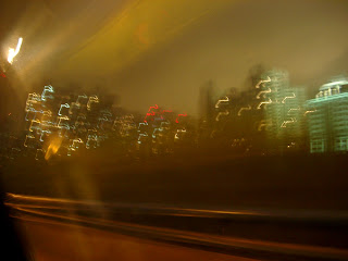
The above example is not in relation to Music Industry, showing clear use of added light to effect the overall contrast of an image, and how this can bring reader' attention to specific zones on a poster/image. I intend on using this technique within my advertisement poster, as I believe it can bring a real contrast to a sum what boring poster that may be abundant within this genre of music. Light is the key to the attraction of a poster, for example, if a whole image had no light contrasts, it would be a simple black and white gradient with no hue or graduation to colour - making it monotonous and un-attractive to any viewer!
Saturday, 7 January 2012
CD Digipak - Creation
When creating my CD Digipack I am going to follow certain guidelines to help me achieve the best possible look that is appropriate to both the music style I am portraying, and the overall attractiveness of the CD Digipack itself. Of course a Digipack doesn't just include a front cover to a CD case; it includes all aspects of the case, both front and back covers along with the trims.
These are the dimensions of a CD Digipack, as you can see there is a monumental amount of room to work with throughout both the front and back covers; however there is also many things to include in these areas. Titles, song names, song lengths, the CD name itself, pictures etc. Therefore the space is quickly dismissed.
I have many photos that I have taken myself to use for the CD Digipack, our group also had a photographer take action shots of the band whilst we recorded the music video, I am going to use some of these action shots when designing the front cover to my Digipack.
Front Cover
I am going to use these three photos from the action shots taken whilst doing a small piece of recording with the band for the front cover of my Album cover, I am going to manipulate the images to create an overall blur of the band as a whole along the bottom of the CD case, with a dark mysterious background. I will use these images as well as another of a blurred lighting shot, I will use this specific shot to cover the top left corner of the CD case, as this space was vastly open without. A black background will be maintained to sustain a look of mystery about the band, I also think darker colours work much better in contrast with the effect I am trying to attain by using blurred images. I am going to add 'A Day To Remember' and 'MONUMENT' to the front cover of the Digipack in white text to contrast the black background, making it easier for potential buyers to read and instantly grabbing their attention so as they know what they are looking at!
Back Cover
For the back cover I will use many different lighting shots to maintain the image portrayed on the front cover, this keeps the feel of the CD Digipack more realistic for a potential buyer. If a Digipack back and front cover are in complete contrast it can be confusing to look at; whereas a cover that flows throughout has a much better overall effect. I am going to include the three pieces of music/art the the album contains and maintain the same text style/colour as the front cover to maintain a pattern throughout the Digipack. I am going to use the blurred lighting effect to bring 'life' to the words, making them seem more lifelike and giving the overall view of the back cover a more creative feel - in perfect harmony with the style of music, Rock.
Trims
For the trims I will be continuing the theme of the whole Digipack by keeping them black, I am not going to add any form of art across the trims as they are covered with a lightly creased plastic packaging and hence any art would be distorted.
Thursday, 5 January 2012
CD Digipak - Research
The Program/s
To create my CD Digipack I am going to use a variety of programs and resources, including the Internet, album cover copies and photos and Text creator programs such as 'Cooltext.com'; however the main program I will be using is Adobe Photoshop. PS is a program which I am incredibly familiar with due to time spent getting used to the program and also previous tasks I have completed using the program.
"Image editing software developed and manufactured by Adobe Systems Inc. Photoshop is considered one of the leaders in photo editing software. The software allows users to manipulate, crop, re size, and correct colour on digital photos. The software is particularly popular amongst professional photographers." - http://www.businessdictionary.com/definition/Photoshop.html
Photoshop will allow me to do certain things with the images I wish to use that other programs would struggle to do; or be able to do at all. Certain things such as adding a grain to a photograph, due to the nature of the CD Digipack that I am going to be creating a grain to pictures will be vital on both the Digipack and the advertising poster.
The Image/s
The images I am going to be using I will take myself, scenery will play a very vital part in the nature of creating my Digipack as I believe a good image creates a very promiscuous feel to any CD cover, intriguing potential buyers. Other images may be created using such programs as PS and others may be edits from the Internet, although the pictures binding the cover as a whole will be a mixture of shots taken by myself.
Due to the band we are using for our music video, the picture needs to tell a story. 'A Day to Remember' are a band that are worldwide renowned for having meaning behind their lyrics and not just creating music that sounds good but music that can help people through both difficult periods in their lives and to enjoy the good times. The band is also under the 'Rock' genre, therefore the album cover needs to be fitting the to style of music played by the band. The pictures portray the style of music on any album cover so this is a crucial.
The Equipment
- Nikon D510016.2
- megapixel DX-format CMOS image sensor
- 7.5 cm (3-in.), 921k-dot vari-angle LCD monitor with wide viewing angle
- Special Effects mode: shoot still images and movies with special effects
- D-Movie: full (1080p) high-definition movie clips
- Home Computer - Alienware Aurora Desktop
- Alienware’s most powerful MicroATX desktop, Aurora delivers strategic component layout, maximising internal cooling and upgradeability for high performance.
- School Computer/s
Wednesday, 14 December 2011
Preliminary Tasks - CD Digipak
What is a CD Digipak?
Digipacks are a type of CD packaging made out of card stock or other heavy paper/cardboard material. Digipacks can flip open like a book, or it can have three parts, so that one portion of the packaging opens to the right and one to the left, with the CD in the center portion. Usually, the portion of the digipack that hold the CD is made of plastic like a traditional jewel case CD - the plastic part is simply attached to the paper background. Digipacks were first created by MeadWestvaco, and their product, called Digi-Pak, is trademarked. However, as the format became more popular and began to be used by more manufacturers, the generic "digipack" came to be used to describe all soft CD packaging.
Digipacks have pros and cons:
- They look nice, and many bands and labels like to use them for aesthetic reasons. The three section digipack sleeves opens up more design options because there is more room. However, they're more expensive than traditional liner notes and jewel cases.
- Digipacks don't crack like jewel cases do, but they will rip and eventually the paper begins to peel apart and separate.
- The trays in digipacks break much more often then in jewel cases. There's not as much protection since the outer portion of made of paper, so the teeth that hold the CD in place crack and fall out easily.
- When the teeth of the tray does break in a digipack, the CD falls out of the bottom of the digipack, because unlike jewel cases, there is nothing to hold it in.
- Digipacks can be more environmentally friendly than jewel cases because they can be made of recycled paper - however, they aren't always in fact made in this way.
This is an album cover by the band 'A Day To Remember', a globally recognized band throughout the 'Rock' Industry. I really like this cover due to its simplicity in the sense that the foreground image is the same colour scheme as the text, which relates nicely to the colour of the background. However the cracks accross the Digipack give it a warmer look, taking away the monotonous feel to a simple Digipack and giving it a more realistic feel - something I hope to achieve in my Digipack.
This is a Digipack by Nirvana, now I'm sure you will have heard of them! This Digipack is phenominal in my opinion, the image tells alot about the album before hearing it, a deep feel is abundant. The text is fantastic, with the band name in it's usual font, (known globally, attracting viewer attention) then the album name in a contrasting font, however keeping in relation to the relaxing waves portrayed by the image. I believe the photo relates to chasing dreams, even from a young age, which is something Nirvana have persistantly achieved since they started back in 1987. The colour of the image is brilliant, with a vertical fade in the background image in the blue, and the text staying simple and punchy.
This is a the CD Digipack for Emarosa, although not known as globally as Nirvana, Emarosa are a specifically targetting band, with the singer doing variations to express the singularity of the band, branching out to other target audiences (with bands such as isles and glaciers etc) The image is a confusing one, leaving the viewer to interpret it how they wish - much like the Nirvana image, although due to the lack of realism, this Digipack could relate to any number of thoughts. I really like the colour scheme across the image.
Subscribe to:
Posts (Atom)


+-+Front+(1).jpg)


